identity development, brand design, campaign, social media, web, animation
Background:
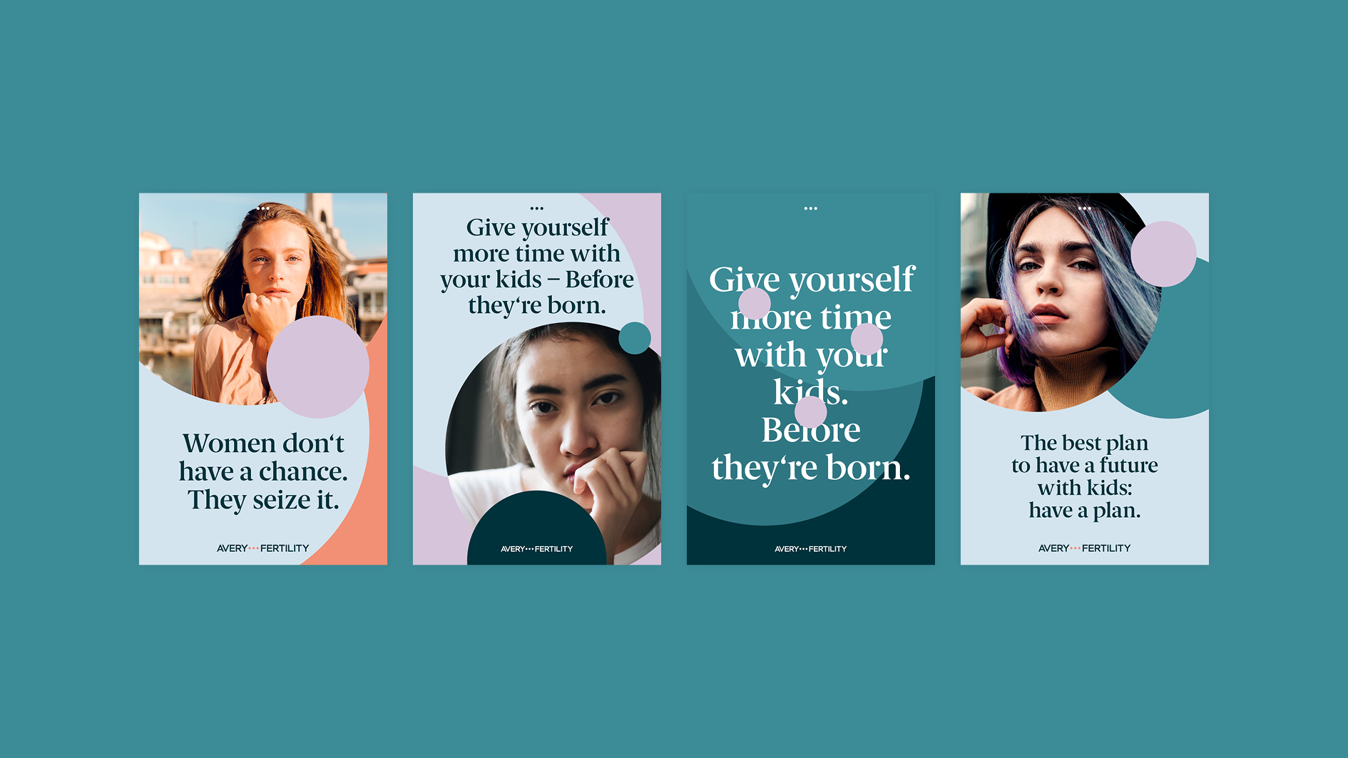
Avery-Fertility helps women to preserve their fertility by freezing their eggs. This medical procedure causes the biological clock to run slower and gives them the time to let them do what they want and love. With this new freedom Avery-Fertility offers women more empowerment. Avery-Fertility asked us to empower them by creating a powerful inspiring Branding.
Case:
Avery-Fertility enables women to live the way they want without feeling constrained by social pressures. This offers them great freedom and time ... plenty of time ... until she decides to become a mother ... or to have a second child ... .These three simple dots »…« would change your life. We took these powerful three dots, creating a clean and simple, yet strong brand architecture for Avery-Fertility: taking the logo as a basis, the empowering circles are omnipresent and applied onto all digital and analog touchpoints - in a variety of colors. Besides a clean, modern and medically accurate Logo-Type Avery-Fertility communicates with a bold, classic yet feminin typographic language. www.avery-fertility.de → Now it’s time for a powerful Branding …